The Public Market should be a place where all of your senses come alive.

Upon entering the Market, local foods such as the aroma of fresh ground coffee should mingle with Jamaican jerk chicken and spicy greens sizzling in the pot. The scent of artisan baked hot bread fresh from the oven, should interlace with sweet potato pie cooling on the counter. Upon entering, one should be transported to another place and another time.
A proper display of Public Market fresh food – there is a sense of abundance, colors are balanced, good smells permeate the air, products fill the space on both horizontal and vertical planes, and, the food looks scrumptious.
Visually, the Market should be a feast for the eyes. Colors everywhere should reflect the Market’s rich tapestry. The foods, art, heritage, history, and culture of the Market’s community should be omnipresent. The production of food should be in front of the customer, not behind in the kitchen.

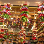
Product displays should be works of art with detailed attention paid to balancing colors and displaying in three dimensions. Products such as braided garlic and peppers, huge cheeses, and smoked meats should hang down from the ceiling. Barrels, baskets, bins, crates, and more should rise up from the floor. Counters should offer sizzling displays as they reach out to grab the customer’s attention. Lighting should pop out the bounty of products, while harmonizing colors and celebrating freshness.
Public Markets should be a tactile experience. Tapestries should sway as they hang from the walls. Construction materials should be honest and authentic – tiles, brick and wood. This is not a place for slick plastic and chrome.
Inside, the sounds of blues or jazz may be heard in the distance from a street musician in the public plaza area.
The Market should be a feast for all senses – a place to experience familiar tastes from the homeland of your ancestors, a place to experiment with new flavors that animate your taste buds with the tang of new and exciting palates.

Hungry yet?
A “stall market” should consist of counter height walls with displays, or counter seating in front, with displays hanging down from above. Displays should occur on the diagonal. The liberal use of baskets, bins, barrels, and crates for product displays should be located in the “spill-out” area. The stall market portion of the Market should allow people to see over each stall to get an image of the Market’s rich bounty. It is fine for customers to look through displays such as braided peppers and garlic. However, high, opaque displays should be avoided.

A Stall at a Public Market in Barcelona showing
vertical and diagonal display.
Color and design can make ordinary items extraordinary
Attractive displays, not signs, are the best product advertisements. Three dimensional signs that are representative of the products being sold, should be encouraged – with approval of the design team. For example, a wooden carved apple protruding from the wall above the pedestrian level could advertise a produce store. Neon should be encouraged. Humor in signage is great. Plastic signage should not be permitted. Signage guidelines should be developed and enforced as a condition of the tenant lease. Hand written signs for individual product sales are fine when attractively wrought and landlord approved.

Attractive Displays and a Welcoming Attitude Help Markets to Succeed
Strolling through the public aisles, customers should experience a fiesta of color, scents and exciting products.
Public Markets should be designed to assure that customers leave with a smile on their faces and a hole in their purses!